360 Degrees of Stephen R. Cox
Posted by Mike Jackson on Jul 18, 2013 in Blog, Website feature | 0 commentsThe work done for author Stephen R. Cox involved more than just a website. We updated advertising copy in fresh cover blurbs for Amazon, re-designed the type set and layout of the book covers, and produced a slick online advertising campaign to build traffic for the new site. And there’s more to come.
Building a Platform
For many authors, connecting with a readership can be daunting, especially the technical work of establishing a web presence. The time and energy it takes to finish a book—and getting it into print—is mind boggling. For traditional authors, a publisher or agent will often help navigate the process of building a website. For self-published authors, like everything else, it’s wading into unknown waters without a life vest.
It isn’t difficult to put together a basic website, but it is challenging to hit all the right notes to achieve an aura of professionalism. We’re talking platform here. The author has to stand in front of his audience and convince them why they should plunk down hard earned dollars for a little entertainment.
The site must look sharp, with content organized and accessible, and most of all it has to be informative.
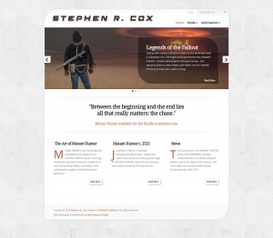
Stephen R. Cox.com started as a do-it-yourself GoDaddy website with just a few simple pages of static content. For the redesign, I gathered content from the existing site and the Mutant Hunter Facebook page to create depth of content and put it all together in a customized WordPress build.
The premium theme used here was Chameleon by Elegant Themes. Like any starting template, it required a fair bit of tinkering to bend it to our needs. There were 100+ lines of CSS and edits to several page templates in PHP.
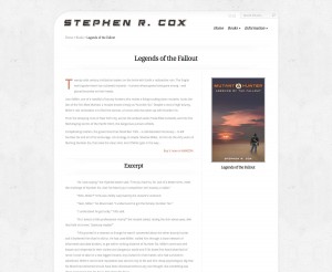
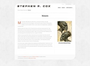
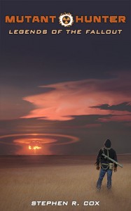
I started with a bold slideshow using Michael Whelan’s cover art. The linked slides forward to the detail page for each Mutant Hunter book, which include the sales blurb with a “buy at Amazon link,” an excerpt from the book, and the cover illustration. The presentation is concise, allowing the audience to explore without being overloaded with too much information all at once.
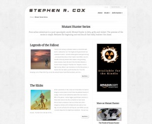
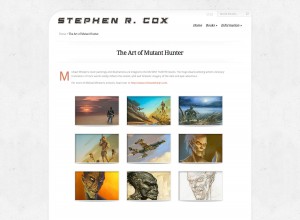
There’s also a gallery of Michael Whelan’s art (sketches, preliminary concepts, etc) exclusive to this site. The thumbnail images in the gallery link to high res JPEGs as well as pages with even more detail about the series. Each successive step into the site leads to more depth of content.
The Total Package
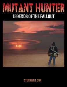
At the same time I started work on the website, I dove into the existing sales material for Steve’s books. With the author’s help, I refined the hook for each book and updated the blurbs on Amazon and Goodreads. This sales copy would accompany other marketing efforts, so it was one of the first projects I tackled. I also sharpened the cover presentation with a new layout, type treatment, and logo.
While Steve is an independent author, that doesn’t mean his books should look self-published. I’ve worked with local authors for many years, and from experience I can tell you that presentation is a huge barrier for building a readership. No one is going to pick up a book with less than professional presentation. Readers assume the writing will follow the quality of the cover and never give it a try.
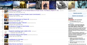
Social media was a focal point of our marketing effots. We generated buzz posting the updating covers and the original illustrations. The goal was seeding an audience through Michael Whelan’s Facebook page and Tumblr blog. The SpecArt subReddit was particularly receptive to his artwork for the series.
We’ve been driving traffic through search engine ads with Bing and Google, but the most cost effective advertising has been on literary / genre blogs like Worlds Without End. The cost on those ads ran approximately 3-5 cents per click.
Steve recently finished The Skin Bags, the fourth book in the Mutant Hunter series. Michael is just starting the artwork for that. So stay tuned for more exciting news on all that. In the meantime, check out Stephen R. Cox on Amazon

